Home 2.0
Personio · 2024 · Alex Guerrero
Design scope
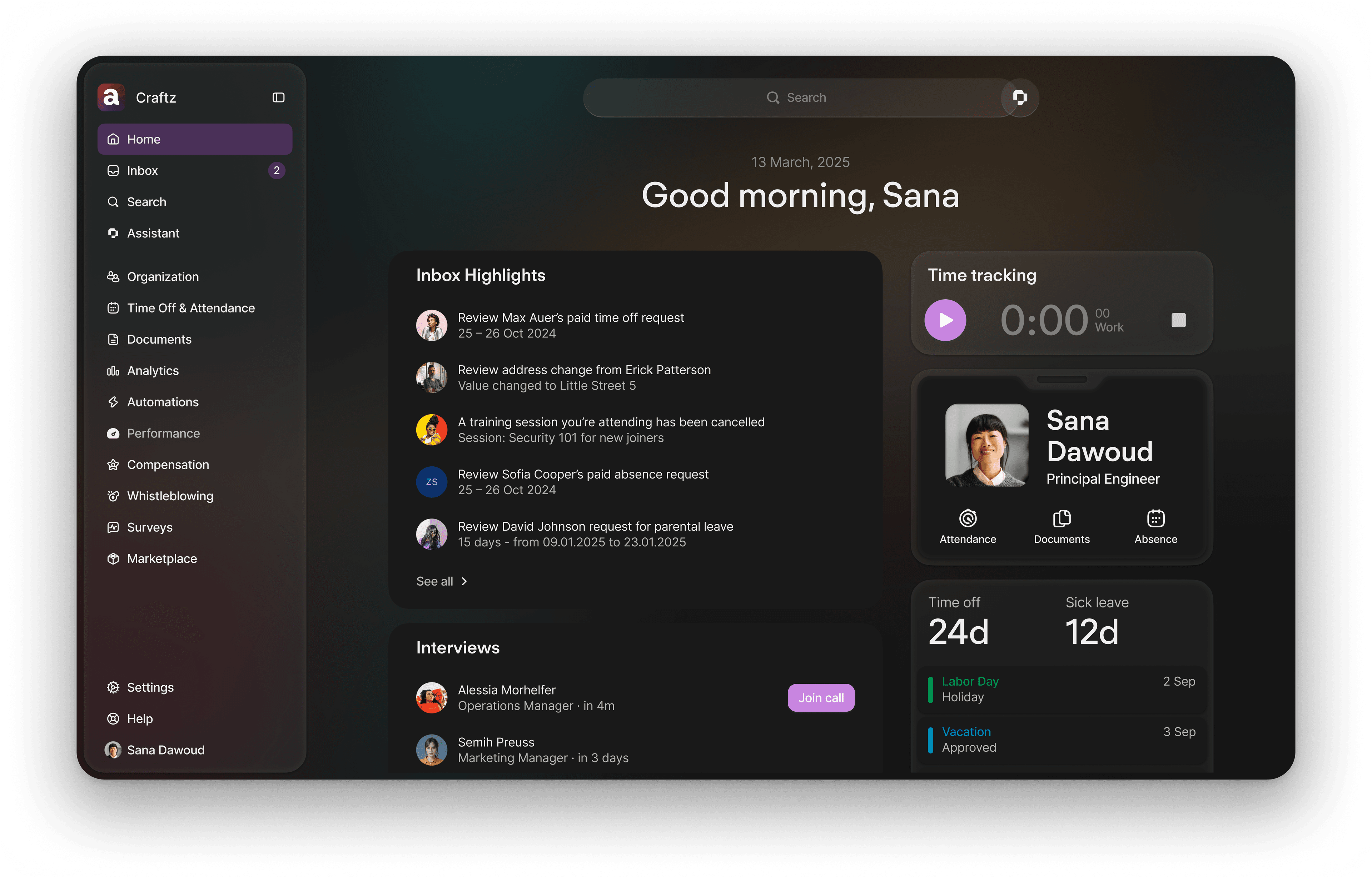
Redesigned Personio's Home dashboard for mid-market customers across UK&I and International markets. Led the shift from an information-overloaded, low-engagement surface into the centerpiece of the new Personio brand — a clean, customizable, brand-forward experience that anticipates user needs and drives 81.8% MAU adoption.
The problem we inherited
Personio's Home was designed to be its dashboard, but it became everyone's escape route. 88% of users navigated away immediately. The experience felt chaotic, over-complicated, and disconnected from how people actually think about their work. That cost us money — €184K in lost ARR to competitors, €210K from churn. The NPS dropped by 4 points right after launch.
The core issues were clear: too much visual noise, no information hierarchy, and features that looked and felt disconnected from each other. But underneath that was a bigger tension — the product was trying to solve functional needs and emotional needs at the same time, without making a choice.
The research
We ran usage analysis, behavioral studies, 5 moderated card sorting sessions, and 20 unmoderated ones across our ICP in UK&I and Europe. The insight was simple but critical: supervisors and employees actually think about information the same way. Both are shaped by their circle of influence — what directly affects them and their work, what helps them manage their team, and everything else is nice-to-have.
Functional needs were clear: record attendance, access documents, respond to feedback, complete recruiting tasks. But so were social needs — people wanted to feel connected to their colleagues, to know when teammates had birthdays or were out, to celebrate together. The experience wasn't delivering either.
The guidelines
Before we could design, we had to decide: what is Home for? We landed on two principles that would guide everything:
Home must effectively solve the functional jobs. That meant being action-oriented, highlighting time-sensitive tasks, and enabling people to deep dive into their data when they needed to.
But Home also had to serve emotional needs. Making employees feel a sense of belonging, delivering delight through color and craft, building an experience that felt like the company's culture lived in the product.
These weren't trade-offs — they were guardrails. If something only solved one, it didn't belong.
The timing
This was the moment Personio decided to overhaul the platform brand. Home became the centerpiece of that overhaul. We had to design for a brand that was still being developed. We had to coordinate the rebrand, the new design system, the customization features, and the core experience all at once.
Flying the plane while building the plane while designing the plane. The pressure was real, but it meant we had a unique opportunity to shape how the entire platform would look and feel going forward.
The approach
We explored how to balance static, predictable content with dynamic, engaging moments. Early concepts fixed content in specific locations — but that created muscle memory that broke when things moved. Other directions mixed everything together — more dynamic, but confusing. The solution landed somewhere in the middle: a hybrid layout where predictable, essential information lived in predictable places, while dynamic content — announcements, celebrations, moments from the team — took center stage.
This wasn't just a layout decision. It was a statement: “Home anticipates your needs and gets out of your way, but the culture and people are always visible.”
What shipped
Clean, modern interface built on the new Personio brand. Customization at the core — customers control colors, depth of content, what appears. Experiences like clock-in, announcements, calendar events, org chart, shortcuts, and pay documents all woven into a unified surface. The design system was streamlined; the collaboration process with product areas became repeatable.
Most critically: 98% of admins completed the customization flow during beta. 80% kept the new experience active throughout. Support tickets on Home averaged less than 4% — nearly all of that unrelated to customization or usability.
What it meant
Home was acknowledged as a revenue generator for the first time. The engagement metrics told the story — MAU went from 54% at the start of H1 to 81.8% by November. We didn't just fix a dashboard; we created a product that made people want to be there.
But the bigger win was what this unlocked for the rest of the platform. The brand-forward, scalable approach Home introduced became the template for how Personio would evolve — not just a Surface redesign, but a signal that design could drive strategy at the company level.
The team calendar widget emerged as the highest-engagement piece of the entire redesign. That opened a whole new set of opportunities about how information density, grouping logic, and visual hierarchy could work together to serve complex personas with overlapping needs — which became its own case study entirely.
As all good stories, there's always more to tell.
Get in touch to request the full case study.